NASH + BANKS — AVALON
Commercial Imperative
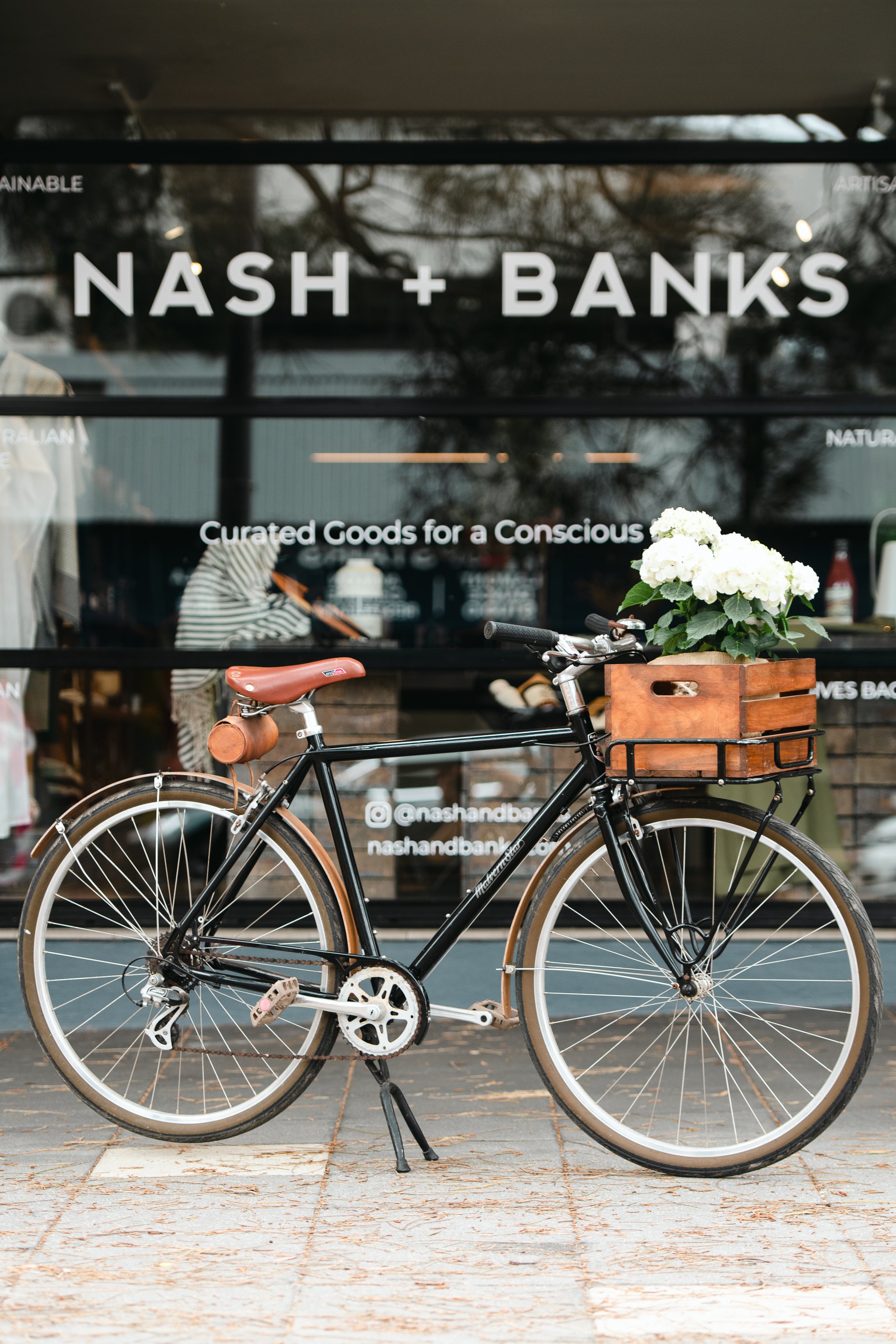
To encapsulate the ethos of Nash + Banks in a physical flagship store by bringing to life an established brand and website, enabling clients to interact with both the owners and artisans on a personal level.
Inspiration
Saluting ethical, sustainable and curated goods for a conscious life, and a homage to wabi-sabi, the Japanese tradition of acceptance of transience and imperfection.
Space
A unit within a retail arcade, the space was a blank canvas of opportunity. With a bold linear quality and existing elements of concrete, steel and aluminium, the LWID team needed to create a space that fulfilled three commercial necessities; being inviting from an external perspective, encouraging flow throughout the store and allowing ample space to exhibit the products.
Inherent in the design concept was the use of sustainable and recycled materials, consciously making tangible the Nash + Banks vision to ‘Make Better Possible’. The use of bricks was an integral part of the design, being both sustainable and symbolising the building blocks of the Nash + Banks curatorial and supportive platform they offer their artisans, who in turn are building and creating their own sustainable products.
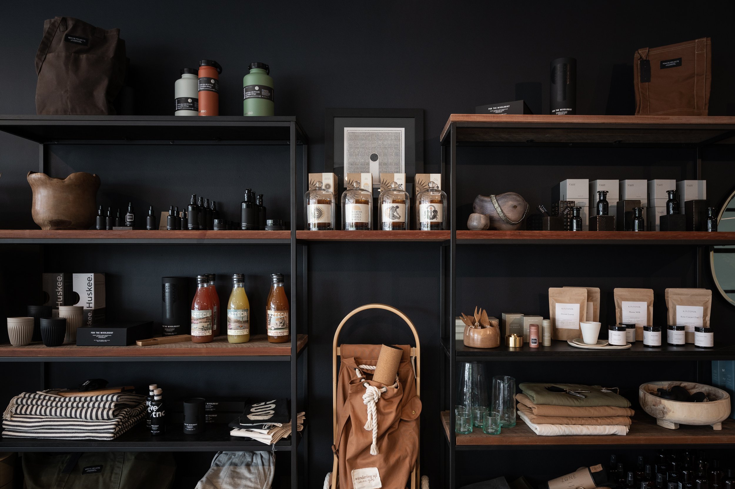
Embracing an uncluttered aesthetic and with a nod to the beauty of Japanese wabi-sabi, the panelled and recycled timber, concrete, bricks and steel offer a solid yet subtle backdrop against which to showcase every item. The open shelving and central table offer a nuanced, almost imperceptible feeling of ‘home’, creating a welcoming environment and inspiring customers to participate in the Nash + Banks experience.
As one of the LWID Makers, the interior design of the Nash + Banks flagship retail store was a natural step in the LWID / Nash + Banks relationship.
PROJECT DETAILS
Interior Design and Decoration: Louise Walsh


